

Or post to Tumblr


|
Additional information
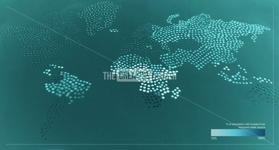
Access to improved water source infographic
This infographic was made to show the percentage of a counties population to an improved water source.
This was made by having different darknesses of dyed water. This was was then placed onto an acetate sheet with a syringe with precision.
|
Share this image |
Advertisement
